CASE STUDY
Smartunited is a company that offers service in the field of science and technology.
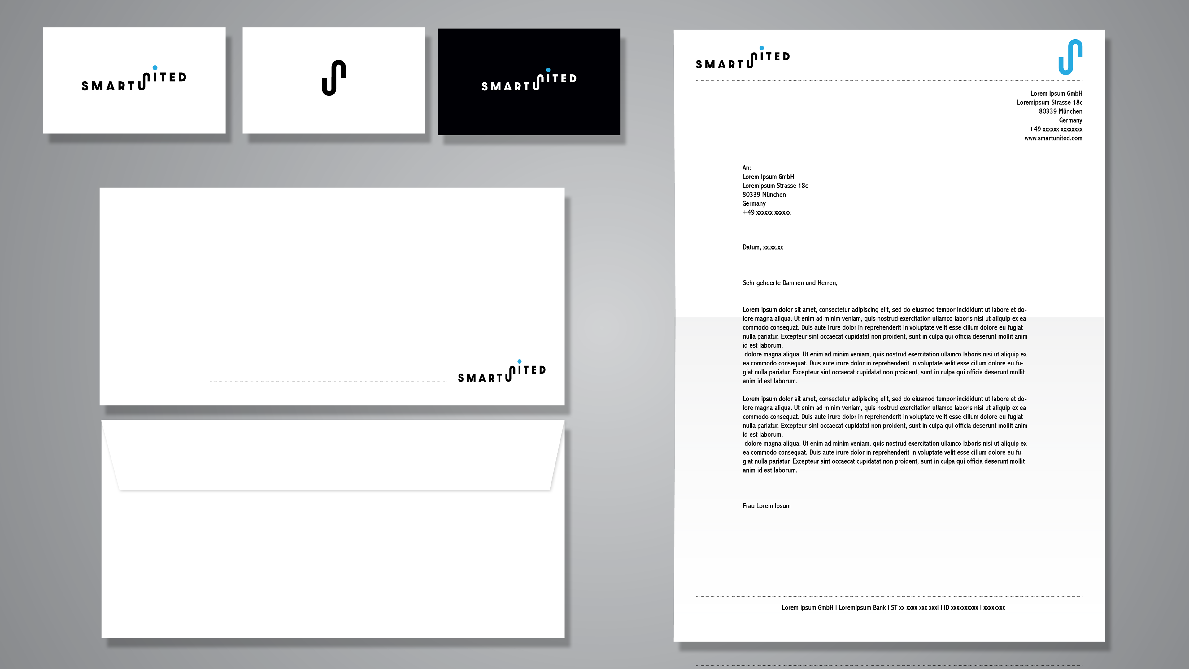
The company required a rebranding of their logo and thus a rebranding of their stationary material and their website.
In doing so, I aimed first of all to understand the context of the product they are making. The company wanted to build an image of a modern and innovative technological start-up with its appearance, which would reflect the image of a Silicon Valley company.
A lot of research was done by me in terms of the visual context, that is, what visual context would best and most adequately communicate the company.
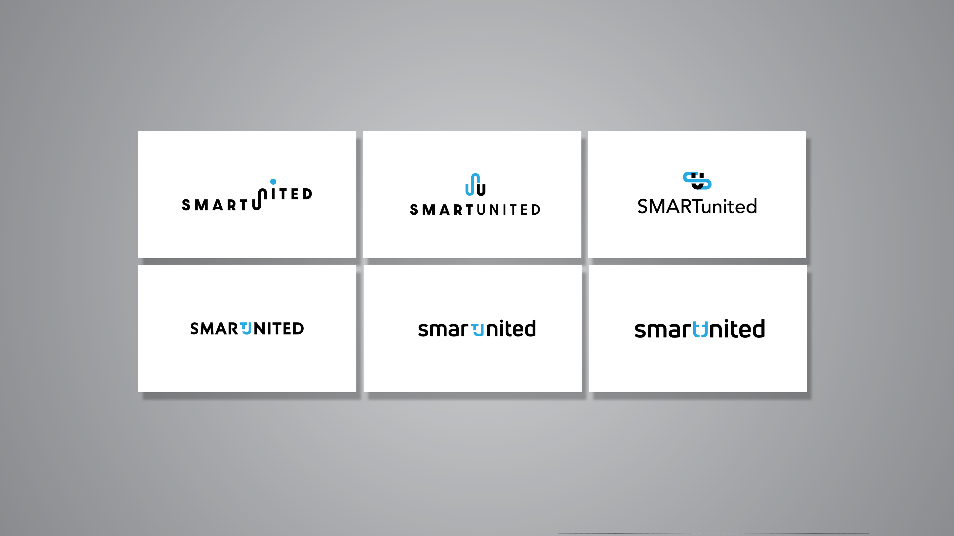
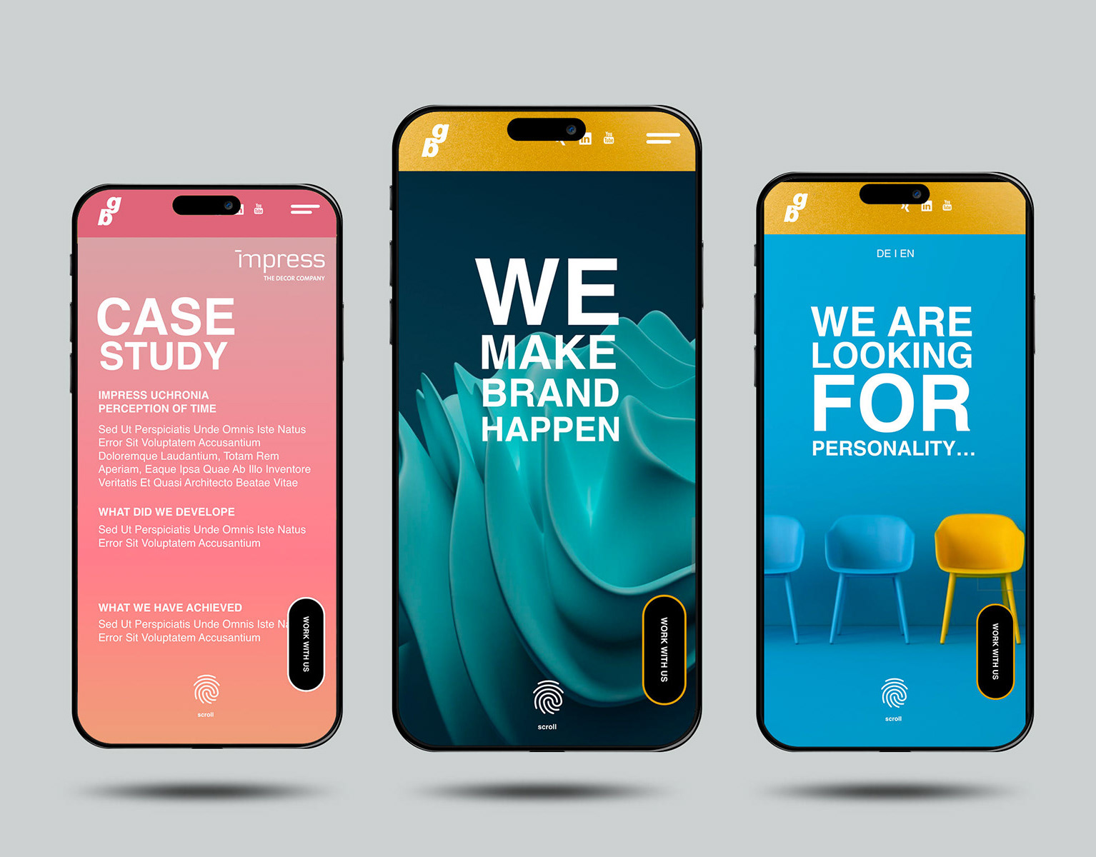
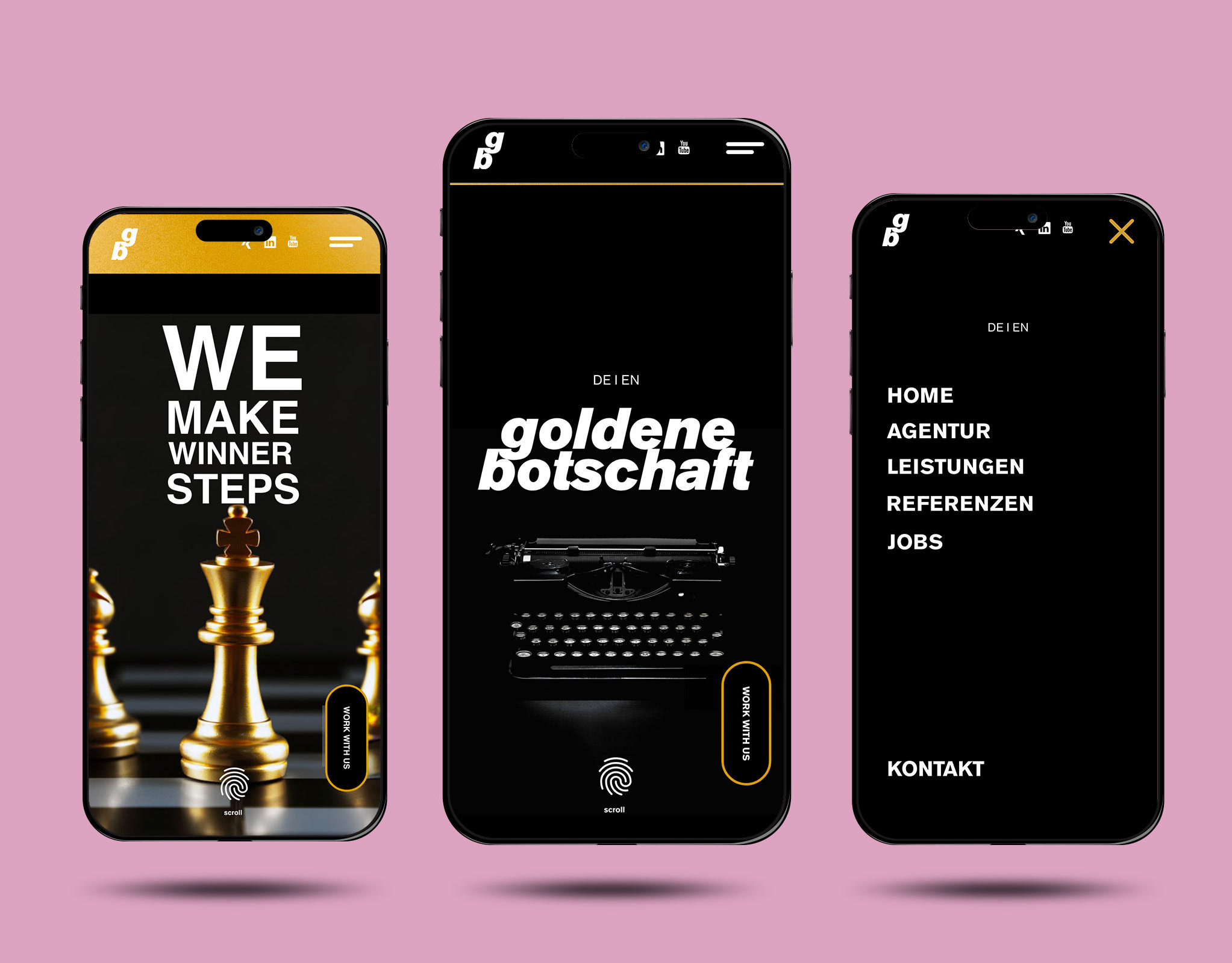
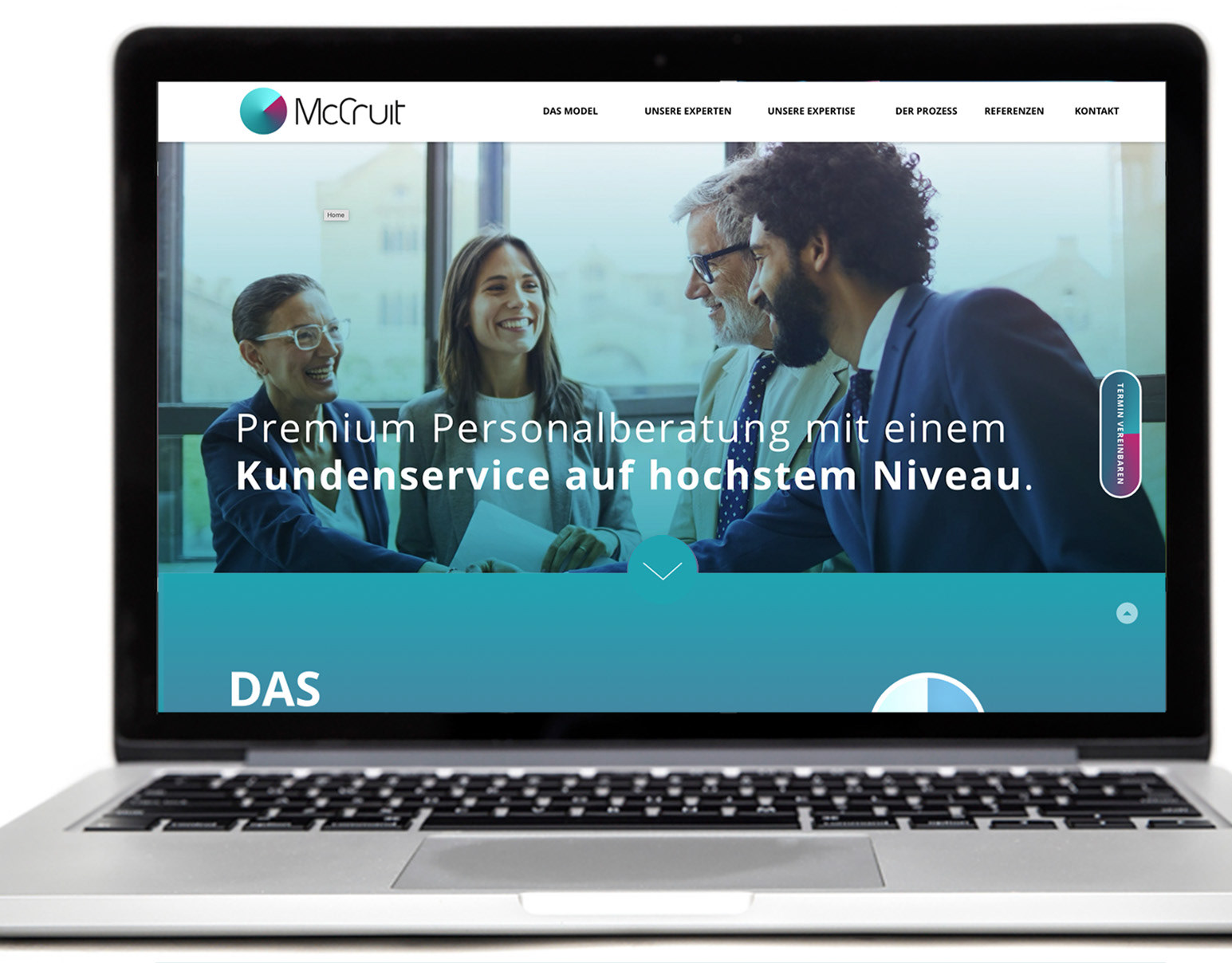
Attached is an animated presentation of the UX solution and the development of logo variations.
Client: Smartunited
Agency: Goldenebotschaft
Senior Art Director: Aleksandar Spasoski
Creative Director: Matthias Trick
UX & UI
REBRANDING & LOGO DEVELOPEMENT
BEFORE
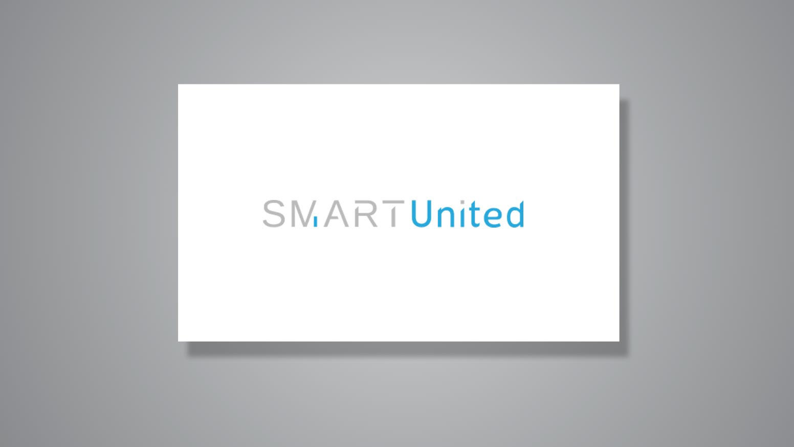
AFTER